So in the aftermath of last week's issues, I have come away with a new graphics card and a new OS: Windows 8.
 | |
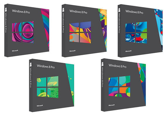
| Which coloured box would you like?! |
Initially, I was going to upgrade my RAM whilst I was at MSY, but my 32 bit version of XP was holding me back. As you may know, Microsoft is selling upgrade packs for Windows 8 for about $40, but you can pick the DVD up for $48 at Officeworks. In the Upgrade pack you get both the 32 and 64 bit versions.
Now, if I was a "Fanboi" of any OS, it'd be Android, but I do like Windows for it broad spread of developers and available support. I'm not being paid by anyone for this. Incidentally, if anyone would like to pay me let me know.
I got home and set to work. As I was still reliant on the venerable workhorse that is XP, I had to manually back up my files. Windows 7 users can upgrade and have Applications, Settings and Files preserved. Going to 64 bit also meant that my PCI Wi-Fi card didn't work. Fortunately I had a spare. Graphics drivers also needed updating after the 36-64 bit upgrade, but you'd expect that.
Installation took less than an hour by my reckoning. I had to boot from the DVD to install the 64 bit version, but that's fairly straightforward to do these days. Installation involved long periods of inactivity, with nary a spinning wheel to indicate progress. It asks a few things of you, but mostly standard install things.
Once installed, I was dumped into the start screen. *
This Start Screen is the most contentious issue surrounding Windows 8. It effectively replaces the Start Menu, but in my opinion performs the job just as well, if not as conveniently. With a bit of practise, you too will master it. The traditional desktop can be accessed from here.
The motivation behind this Start Screen is to blend PC and tablet interfaces. I should clarify- I have not used a Windows 8 tablet yet, and do not see it happening soon. The Start Screen works with a system of tiles, which can be either icons to open "apps" (Microsoft are totes down with the lingo now) or widgets that give you real-time info from various sources. These can range from news, weather or even Facebook. The games app links directly to an Xbox account. The tiles are big, kinda like playing games ported from a console onto the PC; everything is bigger than seems necessary. The overall effect is a customisable summary of programs, much like the Start Menu always has been. It just takes up the whole screen, and more if need be.
 |
| Like the old desktop. Without Start Button. And with a flower. |
Activation is automatic once you get online. As you'd expect, 8 is very insistent that you do, but unlike the old bootlegged copies of XP that I used to use (before buying my own), I have no issues activating now. I suspect there is some way you can block it if you looked. I don't see any reason not to pay for this now; the price is extremely reasonable. You may have issues with Microsoft knowing, or having that information, but I'm not going to get into that sort of thing here.
The whole OS runs very smoothly, even on my 4 year old PC. Like 7, you can get Windows' opinion on your system. I scored a 5.9/10, let down by my "slow" HDD. I got 7+ in all other areas, which is nice.
Overall, I'm quite pleased with the upgrade. Would I recommend it? That depends on weather you have 7 already. The Start Screen isn't terrible, but it sometimes seems almost like a separate OS. There are even two different IEs (or at least two independent interfaces), one for the desktop and one for the Start Screen. Finding things (like a control panel) is not easy from the Start Screen, where you find PC Settings, which is not a control panel. I'm a traditionalist, I like the Start Button. Sometimes though, you just have to get with the times. That said, Windows 7 is still more than $140 OEM, so I'm not inclined to purchase it when the newer product is much cheaper. It was the obvious step after XP, which loses support in the next year or so. Like I implied earlier, if you already have 7, stick with it. If you're stubbornly still running XP, I'd suggest upgrading in the next month or so. If you're looking to upgrade form 7 anyway, do it soon before the cheap upgrade expires!


Nikon made a lens with shift movements in 1962 and Canon made a lens with tilt and shift movements in 1973. Tilt shift photography is used to make normal items or places look like a miniature scene.
ReplyDeletegta 5 apk